Email marketing is one of the most popular content distribution channels. And it works quite efficiently. Everybody knows that email has the highest ROI among all other marketing channels. The reason is quite obvious. You create a list of contacts interested in your product, and send them timely and engaging content to get them to buy from you repeatedly. Emails allow you to send highly targeted and personalized content to the right people, hence reducing the costs and increasing the ROI.
But to take advantage of email’s great potential for content distribution, you need to know how to design them effectively. In this article, we discuss the most common email design principles you should use to see the most impact.
Email Design Principle #1: Prioritize the Copy
The obsession of over-designing beautiful emails should not get in the way of writing engaging copy. As a matter of fact, many email experts prioritize email’s copy over the visual design. Let’s dig a little deeper on how you should do email copywriting.
The copy of your email has two main parts on which you need to focus:
- The Email Preview (what the receiver sees before opening the email)
- The Email Body (what the receiver sees after opening the email)
Obviously the first part is important for getting your email opened in the first place, while the second part is focused more on getting CTA clicks.
1. The Email Preview
Most email-inbox interfaces these days display three parts of your email: the sender’s name, the subject line, and either specific preview text or a portion of your email’s body copy. Here are some ideas for optimizing these all-important elements to help your email stand out.
- Personalize with the sender’s name. The sender’s name is arguably the most recognizable element that a reader will see when scanning a list of emails. I personally prefer the combination of your first name + your company’s name (if you have both data points).
- Honest subject lines work best. The hype over attention-grabbing subject lines is overrated. Kudos to clever subject lines, but sacrificing everything else for your clever subject lines is not a good idea. Avoid deceptive and clickbait subject lines at any cost. If you can’t come up with a clever (but honest) subject line, a description of what the email’s about is a good choice. Hunter’s guide on subject lines is worth a careful read here.
- Pay special attention to the first few words of your body copy. Whether or not your email marketing platform includes a “preview text” field, this advice doesn’t change. Understand that people are going to judge your whole email based on the few words that are visible in the preview part of your email. Make sure to spend time to make them interesting and engaging.
2. The Email Body
The body copy of your emails has one singular goal: get people to act. Omnisend’s guide to email strategy explains: “every single email should have a single key goal. And that goal should have a clear call-to-action button”. Define your specific goal and write your body copy to achieve that goal. A few other things to keep in mind:
- Your email’s body should not divert from what you have promised in your subject line and preview text. You don’t want to lose people’s trust in your email communications.

- To write engaging copy, you need to know your audience well. It’s more about addressing their core issues, problems, or interests in a timely manner than the choice of words. Research your audience’s demographic (age, gender, nationality, etc.) and psychographic (interests, concerns, issues, etc.) and write your copy like you are speaking directly to them.
- Be clear about your offer and include a big, obvious CTA within the email, wherever is appropriate.

Email Design Principle #2: Use Consistent Branding Elements
Branding is about leaving your mark in all your marketing efforts. Your email design should reflect your brand as well. To do this, apart from the tone and style of your copywriting, you need to be consistent in the choice of such design elements as fonts, colors, icons, etc.
Brand consistency in your emails makes it easier for people to recognize you when they receive an email from you. This increases the chances of getting your emails opened and your links and CTA’s clicked.
You want to make sure that people who see your website, your social media profiles and your ad campaigns have a consistent experience and expect the same good results from you. So even after clicking your links and CTA’s in your emails and being delivered to your landing page, you ideally want the viewer to feel they are in the right place every step of the way.
Here’s a quick look at how Freshworks (formerly Freshbooks) keeps its branding consistent through its different channels.
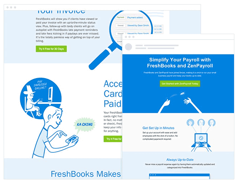
By using the same copy and design elements for its website and email, Freshworks manages to:
- Provide the same pleasant user experience for its users across all channels.
- Stick its messages and values in the mind of its customers for a longer time.
- Create trust and credibility for its brand.
Email Design Principle #3: Optimize for Mobile
61.9% of email opens occurred on mobile in 2019 according to stats provided by EmailMonday. Obviously if your emails are not optimized for mobile viewers, you’re providing a bad experience for a huge chunk of your readers.
Most email services have the option to view the email on different devices such as desktops and mobile phones. Make sure to use this option to check out your emails before sending them.
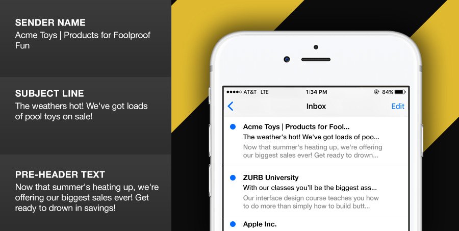
Image Source: Zurb.com
There are some ways to optimize your emails for mobile:
- Optimize the sender’s name. As you can see in the image above, the first thing that’s seen from an email on mobile is the sender’s name. So you need to optimize that to have better effects. There are various formats but the one I’m personally interested in is [sender’s first name + company’s name] like “Brody from DivvyHQ”.
- Keep your subject lines short. Because mobile phones are held vertically most of the time, the length of your lines should be so much shorter. The optimal subject line length on mobile is 40 characters and below.
- Use large fonts and write in one column. The optimal width for your emails on mobile phones seems to be 600 pixels. Try not to exceed that.
- Don’t use too many images. Images are great for getting people’s attention, but consider using them sparingly (such as backgrounds, product images, data visualizations, etc.) Heavy images take longer to load and are in many cases blocked and not shown in the viewer. Remember to use alt texts for your images as well.
- Consider post-click optimization. The success of your email marketing depends on whether people would act in the page they’re being directed to from your email. Always use responsive design to optimize your pages for mobile and optimize them for more conversions.
If you’re more serious to reach your audience on their mobile devices and maximize your conversions, you can take advantage of a multichannel mobile marketing software.
Final Words
Phone numbers, mail, and emails are some of the most popular direct marketing channels. Because of the great personalization potential of these channels, they’re used more frequently as lead nurturing and customer acquisition methods as well. You basically do all your marketing to get people’s email addresses or phone numbers and start building trust with them through meaningful communication.
Email is more preferred by people because of the ease with which they can respond back to the brands as there is no pressure to respond quickly. They can respond back in a few days and still consider the communication fruitful. If you’re interested in faster communication that is as fruitful as email, consider using live chat for your brand.
For more great tips, tricks and how-tos, subscribe to the DivvyHQ blog today!