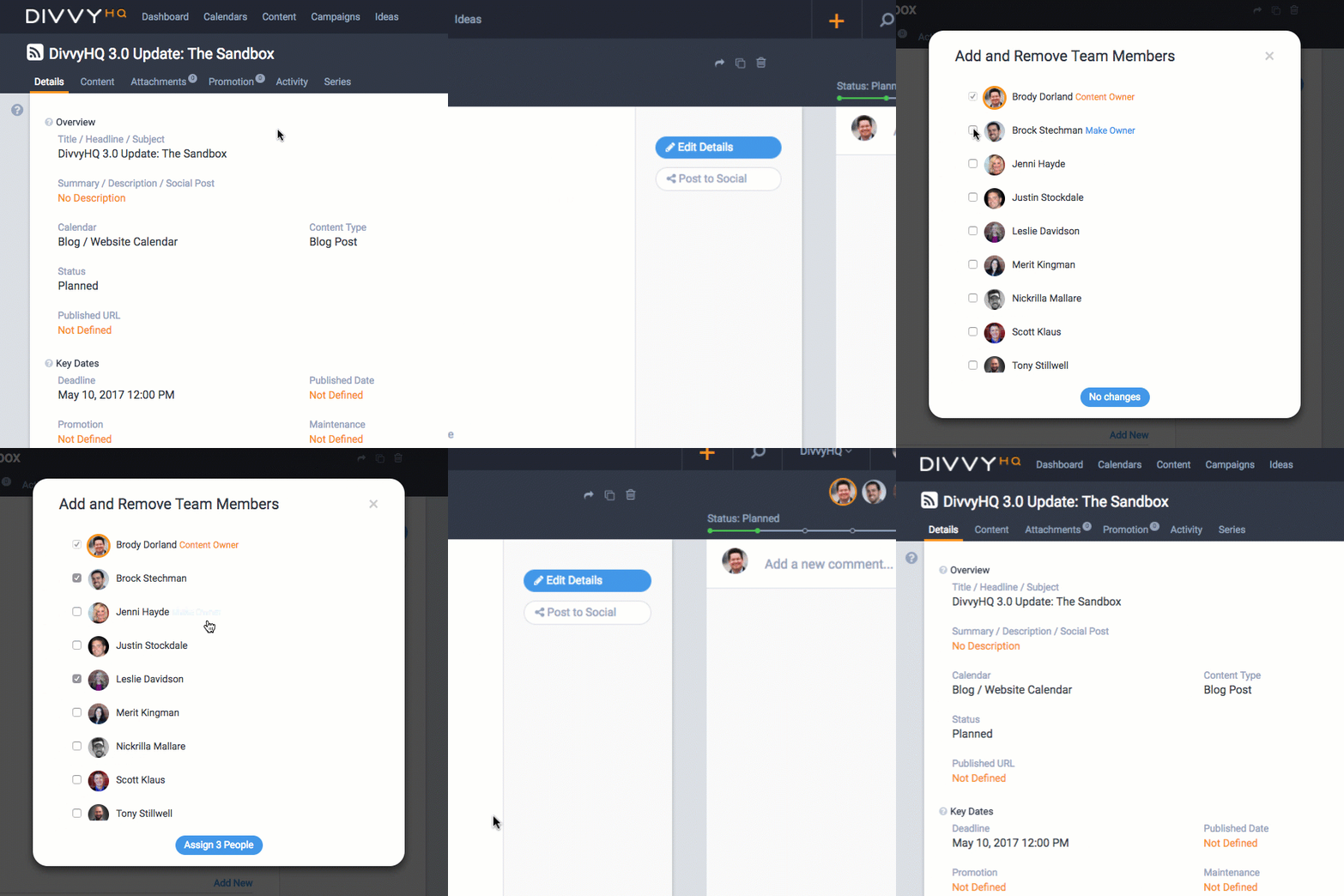
On behalf of the DivvyHQ team, we’re very excited to introduce the new content production area: the Sandbox. This interface has been many months in the making and, alongside the all-new design, there are many behind-the-scenes improvements that improve usability and performance, and will help us expedite future Divvy 3.0 components.
Why “Sandbox”?
As our product team dug into the task of reviewing customer feedback and re-imagining this interface, it became clear that continuing to call it the “Content Editor” simply didn’t match the breadth of features, typical usage and the value that this interface provides. The actual creation and editing of real content is only a subset of what this interface does. So we kicked off a naming exercise and landed on a name that encompasses more of it’s value.
We think of a sandbox as a safe environment (you aren’t going to break anything) where you can be creative, collaborate, iterate and stage something (content in our case) prior to it going into a live production environment (i.e. a public website, blog, etc.). This name fits nicely in our book.
A Quick Walkthrough
Design & UX Considerations
Within any content marketing software application, the content production and collaboration area is always going to be the most complex. It has to house and present every content detail and facilitate a creative process that is rarely consistent. Content comes in all shapes, content teams come in all sizes, and everyone uses the application differently. At the end of the day, our goal has always been to help you get a content project from idea to published as efficiently as possible.
Feeling Cramped – With our 3.0 Sandbox now live, I can say that we always felt cramped with our 2.0 Content Editor. There are simply too many things to display on one screen and even then, we weren’t able to give several, heavily used features the screen real estate they deserved. The most noteworthy example is the actual HTML editor, which now has it’s own clean space. There’s less clutter and distractions to help you focus on creating great content.
Dealing with Big Lists – There’s also the consideration of customers that have huge content teams and long lists of content strategy metadata. As you navigate the new Sandbox, you’ll notice how we’ve revamped how team members are assigned (shown below) and content strategy lists are presented and used.

Locked for Editing – Although we previously provided a warning notification to users when they opened a content item that was currently being editing by another team member, overwriting content and details was still possible. The new “edit states” for the Details tab and Content tab provides a much more secure environment that should eliminate any potential issue of team members editing the same piece of content simultaneously.
Other Slick Improvements
Alongside the big, noticeable changes, we implemented a variety of smaller quality-of-life improvements, many of which were requested by customers over the years. Here are a few of the more noteworthy…
- Production Clock – The clock starts when you start editing a piece of content in the HTML editor. Note the time when you’re done to track how long you’ve been working. In the future, we’ll store this for you and add it to the recent activity feed.
- Word & Character Counters – Need to hit a certain word or character count? These will help.
- Auto-refresh on comments – Previously, a new comment wouldn’t populate in the comments panel without a manual refresh. Now they automatically populate (great for real-time collaborative editing)!
- Improved UX on Production Schedule / Tasks – Viewing a content item’s production schedule and working with large task lists should be much more manageable going forward.
- Activity Stream Design – As we’ve worked with more and more big content teams, we have a better understanding of the importance for capturing and seeing the history of activity on a content project. The new Activity tab provides a more digestible log of each project’s progression.
The Sandbox Roadmap
I tend to make our CTO nervous when I openly talk about new features on the horizon, but I think he’ll be ok with this… the roadmap for the Sandbox is 100% frequent customer requests. Stay tuned for more interface customizations, automation and version tracking.