Landing pages are demand generators, and they can cross every area of the funnel. Ebooks and whitepapers are great for top-of-the-funnel. Your goal is to educate and inform them before moving through the funnel. Interactive content could be mid to bottom-funnel, and comparisons and case studies would be a the bottom.
There are many best practices to deliver a landing page that creates interest and curiosity. Some keep the design simple, while others are bolder, like using interactive aspects. Ultimately, you want to build a page that conveys trust, an understanding of your audience’s challenges, and the promise of solutions.
If your content analytics show underwhelming performance with your landing page, it’s time to rethink the content and design. The first step to take is to dig into the data.
Look at the Story That Data Tells
You have access to massive amounts of data regarding your landing pages. You can see how users arrive there — organic search, social media, third-party sites, paid ads, etc. You are likely using these content landing pages in a variety of campaigns. Putting together the story of where you’re pointing people versus the actuality of where they find you can be very eye-opening.
For example, you have a landing page for content you’re using in three channels: organic social media, an email nurture series, and a paid trade ad. In all three of these channels, you’re working on the awareness stage. So anyone that sees the content from those places just realizes they have a problem or is looking for an innovative way to solve it.
If you find that most people are hitting the page from your paid trade ad, that tells you that your audience does relate to the content. Those buyers may also find your content more credible and trustworthy because it’s associated with an industry group they respect.
You’d have different conclusions if social media posts were driving the most visitors. That would tell you that you’ve landed on a popular, trending topic. It also demonstrates that the channel is one to optimize for distribution.
Data always tells a story. You can learn so much more from metrics as well, including things like the time they spend on the page. If you use any tool for website heat mapping, you’ll also discover how users behave on the screen, regardless of if they convert.
Every data clue you add to your analysis helps you learn and improve your landing pages.
Try Something New: Interactive Elements on Landing Pages
Interactive content can create a lot of engagement. That’s because they make the viewer part of the content. It’s part gamification, part visual appeal. Including these elements on a landing page can be the start of a buyer’s journey where they are literally in a position of discovery. It’s a unique way to deliver content.
Here are a few ideas.
Quizzes
Everybody loves a quiz. Otherwise, they wouldn’t be such a staple on sites like BuzzFeed. Almost any industry can capitalize on this trend. The goal is to help audiences realize certain shortcomings or assess how they’re doing.
Below is an example from Axway. Users take an assessment, get a score, and then register for a free report.

Image: Axway
Choose a Path
Another option that’s great for recommending products or services is with a choose a path landing page. Think of it as a business-suited “Choose Your Own Adventure” concept. You pose questions to a user, and, based on answers, they keep moving through the workflow until they reach a recommendation.
Once they reach their answer, the conversion could go in a few directions. You could offer a download of the product, a free trial, a demo, or provide a video of the product. It depends on where you place this in the funnel and what you sell.
ROI Calculators
Numbers matter in so many businesses. You’ve probably seen many of these on mortgage and real estate sites, but there are so many more applications. If you’re trying to demonstrate ROI as a key element in decision-making, let them do the math.
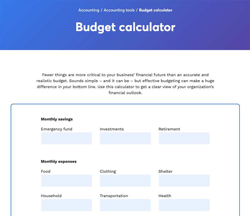
You could also use a calculator to help individuals or companies budget effectively. The user will receive results after they complete the fields, but the engagement doesn’t stop there. Offer them a free trial of the software or a consultation.
Here’s an example from Wave Accounting.

Image: Wave Accounting
Compare and Demonstrate with Landing Pages
Looking to the bottom of the funnel, you need landing pages that seal the deal. At this point, your buyer is aware of the problem. They’ve researched and considered. They are just looking for further validation that you’re the right solution for them.
Comparisons and case studies are critical content assets to use here. A comparison does just that — compares your product or service to competitors. Case studies, especially those that use company names and have strong metrics, reiterate that you can solve their challenges.
These landing pages should be very persuasive. It’s not a hard sell, but the language and design should focus on proof points and the ease of becoming a customer. You don’t want anything that would distract or stop them from taking the next step of making a purchase, starting a trial, or requesting a demo or proposal.
Landing Pages That Convert: Moving Your Prospect Though the Funnel with Engagement
Landing pages are vital parts of inbound marketing. You can develop these for every stage in the funnel, ensuring that your audience receives high-quality, informational content that solves their issues. In addition, by using data to improve pages, you can see greater results, whether the pages are for an ebook, interactive asset, case study, or comparison.
Want more great tips like these? Be sure to subscribe to the Divvy blog, written by and for content marketers.