Creating compelling and relevant content is hard. Getting viewers to commit to an action is even harder.
Using a generic call-to-action can cause prospects to bounce, but finding the right combination of relevance and placement can boost sales by 83%. Fortunately, once you discover CTAs that work for the types of content you produce, you can put them on repeat for future assets.
We’re diving into what makes a good CTA and examples that you can use for a call-to-action template. Use these ideas to add your brand’s flair.
What Goes Into an Effective Call-To-Action Template?
A call to action in content marketing serves the same purpose as it does in an ad. You use it to drive your audience to take a specific action that moves them further along the buyer’s journey.
Crafting a compelling call-to-action requires more than falling back on uninspiring standbys like “Subscribe,” “Contact Us,” or “Get Started.” While these tell the viewer what action you want them to take, they aren’t exactly encouraging, at least not on their own. An effective call-to-action template should include:
- Strong action words: The text in your CTA should be action-oriented. In that regard, the above examples work. Your audience doesn’t doubt what you want them to do.
- Simple phrasing: Your call-to-action should be concise and straight to the point. The more complex the language or design, the more likely you will lose your audience.
- Relevant value: Make sure whatever you offer in your CTA has value that matters to the intended audience. It should coincide with where buyers are in the journey when they engage with the content.
- Personalization: Personalized CTAs are more effective, to the tune of 202%. Set up your call-to-action template for specific buyer personas and make sure those individuals see it at the right time.
- Emotional appeal: An emotional connection influences 95% of all purchasing decisions. Introduce an element of scarcity or exclusivity to trigger a fear-of-missing-out response. Use language that motivates or instills hope to promote solutions-based products.
- Visual elements: The visual component in a CTA includes placement, timing, and design. A landing page may contain a heading, short paragraph, button, and image, all working together to present an informative and visually appealing design.
When creating your call-to-action template, use as many elements as possible.
What Kinds of CTAs Are There?
The kind of call-to-action you use depends on the type of content you want to use it for and the goal for your user. Common calls-to-action include:
- Buttons
- Landing pages
- Linked text
- Pop-ups
- Slide-ins
- Banners
Buttons tend to be the most abbreviated CTAs, while landing pages usually involve more text and visual elements.
What Are 5 Call-To-Action Template Examples?
We’ve pulled together five examples that can serve as a call-to-action template, providing inspiration for structure and phrasing. You need to make your CTAs uniquely you, reflecting your brand voice as well as your audience personas.
1. DivvyHQ
Our website’s homepage is set up like a call-to-action landing page above the fold. Website visitors immediately see what we offer and how to check out our solutions by requesting a demo or watching a video. We include an additional “Try it for free” button on the menu bar at the top of the page, which is also a good option in a call-to-action template. Who doesn’t like free???

The text we use appeals to visitors looking for a solution to the often-chaotic nature of content marketing. The imagery provides a visual summary of how we help, along with the smiling, happy faces of customers who are decidedly not experiencing chaos.
2. Glossier
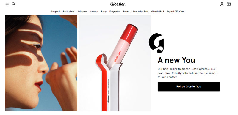
This company knows its target audience well. It appeals to the taste of Gen Zers with personable language and a button with the fun and unique “Roll on Glossier You.” This company bucks tradition in many ways, an aspect of the brand’s image that plays out in its CTAs.

Source: Glossier.com
The text on Glossier’s website doesn’t always conform to capitalization rules, but it works for them. While the images are professional and sleek, they are also simple and clean.
3. Apple
If you want a simple call-to-action template, look no further than Apple. The company’s CTA might be simple, but its message is loud and clear. It uses few words, relying on stunning, bold imagery and the knowledge that anyone visiting the website is probably well aware of the iPhone.

Source: Apple.com
Though the CTAs aren’t in button form, you know what to do. Note the second CTA along the bar at the top, announcing savings for customers with a phone they can trade in.
4. REI
Outdoor adventure gear and clothing giant REI scores points for its relatable and relevant email sign-up CTA. Though the “sign up” button isn’t novel, the rest of the messaging is tailored for a specific target audience, from the photo that fires up the imagination to the description of what they receive.

Source: REI.com
REI also speaks to email-list fatigue by promising to be a good penpal. This kind of relatability is a nice touch to include in a call-to-action template.
5. Bombas
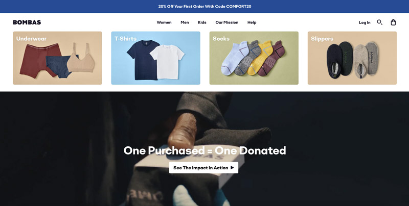
Way back in 2013, when Bombas got its start, social responsibility wasn’t as prominent in consumers’ minds as it is today, when 70% of people think brands should be involved in social issues. Website visitors start to learn about this company’s commitment in the text and image on the home page, but the CTA button invites them to “See the Impact in Action.”

Source: Bombas.com
Bombas also includes a banner that offers a 20% discount for a customer’s first purchase. These two calls-to-action send the message that profits aren’t the brand’s top concern, which can engender trust and move prospects further down the funnel.
How Can You Manage Your Call-To-Action Template Creations?
After you rock your CTAs, how do you manage them? Writer is an AI content creation platform with a very useful feature called “Snippets,” which allows you to create complete call-to-action copy, code snippets, and messaging that you might put together in various ways. They’re all stored and accessible in an easy-to-use library.
At Divvy, we help you simplify your marketing life. You can integrate Writer into our platform, giving you access to any call-to-action template you need right from where the rest of your content production magic occurs. Request a demo to see for yourself how we eliminate content chaos. (One more CTA incoming!)
