If you were to see a can of soda with a particular shade of red with swirly white lettering, you would immediately think it was a can of Coca-Cola. Even if the words were not written directly onto the can, the company’s brand identity is what caused you to think of it so quickly.
Although we may not always stop to reflect on it, this kind of brand identity surrounds us at every moment. This is because companies with a strong brand identity have readily invested and dedicated themselves to brand guidelines.
Brand guidelines establish parameters a brand should follow to standardize brand elements across the board, no matter who is creating content. For example, statistics show that using a signature color can cause an 80% increase in a consumer’s recognition of your brand. This is only a small part of following brand guidelines, so imagine the potential possibilities of implementing strong brand guidelines across all audience touchpoints.
Think about this… It only takes 1/10th of a second to form a first impression of someone. And it takes about .05 seconds for people to form an opinion about a website. Therefore, a brand must provide a solid first impression through its brand guidelines and tone of voice.
In this article, we will discuss brand guidelines, why they are important, and show some fantastic examples of brands that just got it right.
Let’s dive in.
What are Brand Guidelines?
Brand guidelines are set rules and standards that showcase your business to the world. They help ensure that your brand is consistent and in line with who your company is, what it does, and what it stands for. When a company adopts brand guidelines, they are adopting rules that will standardize the look of a brand and establish a strong brand identity.
Conduct some research and visit popular websites. You will note on many sites that the brand’s messaging is consistent. Photos have a similar visual style to them. And typefaces are always consistent. If these elements are easy to spot on a website, it means that the brand has implemented strong brand guidelines.
What are the Components of Brand Guidelines?
Brand guidelines back a brand identity. The guidelines, however, are more than just a simple set of rules that one must follow. Those guidelines are more than just what a logo should look like or what font to use. In reality, a brand identity is a company’s look, feel, and voice. It allows customers to understand what the company does and what it stands for.
To ensure consistency across the board and understanding from those who will use the brand guidelines, you should consider adopting the following elements into your brand guidelines:
History of the Brand
Include the who and why behind your brand. 88% of consumers say authenticity is important when deciding which brands they like and support, so when a company chooses a brand identity and sticks with it as its true and authentic self, it leads to excellent brand loyalty.
Character and Personality Traits
When people think of your brand, what personality should they think of? Should your brand be a lighthearted voice or perhaps a more serious one? What traits should a customer hear in your brand voice? A lawyer, for example, generally has more serious traits than a food brand. Choosing the right voice is important because it will shape how your customers view your brand.
Logo Guidelines
You need to standardize the look of your logo and how it can be used. Set boundaries on sizes and backgrounds to ensure that when people spot your logo, they will remember and identify your brand.
The size of your logo, the font, and the color you go for will depend on who fits your ideal customer profile.
Graphics & Layouts
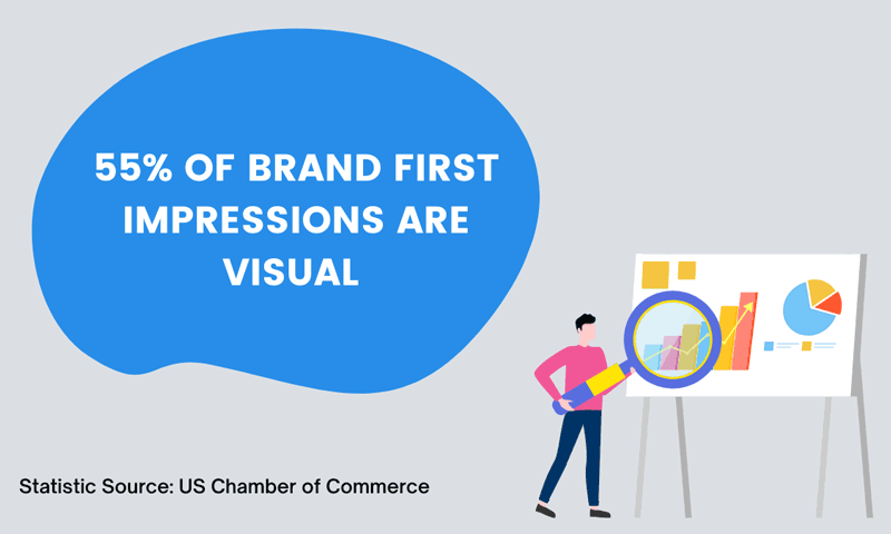
Source: US Chamber of Commerce
Establish templates for graphic elements and design layouts. Have examples of what a flyer or billboard should look like so all elements are consistent. Providing examples of these types of assets for designers will reduce headaches on future project collaboration. Design guidelines are perfect for sharing with content creators or marketers working with your brand.
Color Palette
Choose a color palette for your brand. Select which ones go best with your brand identity, and make sure you know the psychology behind the colors. For example, the color blue delivers emotions, while white gives peace. Define which message you want to provide through colors and establish your palette.
Typefaces
Be consistent. Narrow down your font choices to 2 or 3 options and consistently use them in your brand.
Photography Guidelines
Define what kind of photos may be used in your brand. If you prefer close-up action shots or more abstract photos, now is the time to define this. That way, when someone is working on your content marketing, they will be able to follow the look you want.
Writing style guidelines
Decide what your brand personality, voice, and tone will be through a set writing style. Is passive voice allowed? What kind of bullet points should be used? When are acronyms permissible to use? All these things (and more) should be laid out in the writing style guidelines.
Why Should I Use Brand Guidelines?
Establishing a brand identity without guidelines is seemingly impossible.
If a lawyer were to study ranking factors, for example, they would have to have a guide to follow. The same applies to this scenario. If more than one person is working on communications within your company, you will want to have rules for all to follow. If not, each individual may start creating work that looks great but does not really show off your brand identity.
When creating communications for your brand, it is important that all stick to your brand guidelines. Statistics show that 64% of consumers make a purchase after viewing a branded social video. Therefore, the branded video in this scenario is a pathway to success formed by ensuring appropriate branding.
6 Brand Examples That Get It Right
The perfect way to teach someone is by showing them. And that is exactly what we will do here. Below are six of the best examples of companies who implemented brand guidelines and just got it right.
#1 Starbucks
Source: Starbucks
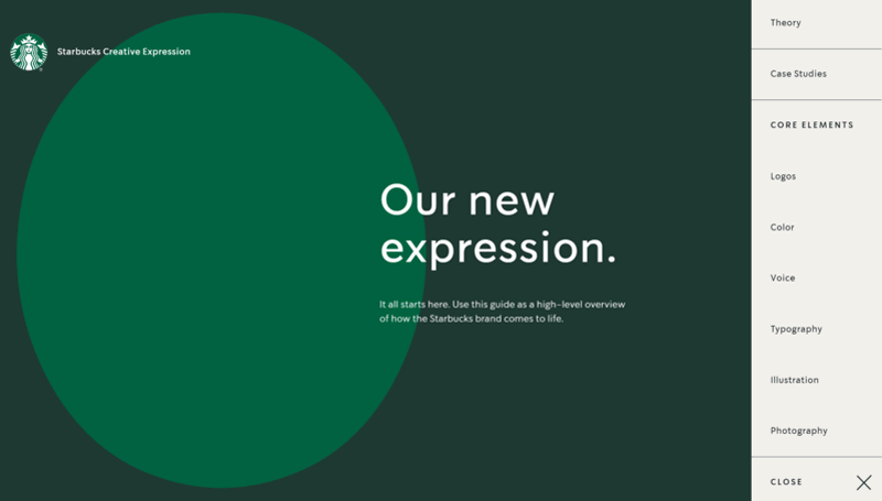
It would be impossible to speak of brand guidelines and not mention Starbucks. Starbucks tops the list of brands that have effectively implemented and stuck with brand guidelines. So much, that their brand guidelines are available online for all to see.
The brand guidelines hit all the important points that a content creator should know. The guidelines start with theory and case studies of the elements in different scenarios and campaigns. Then, it shows how everything flows together and stays in line with their branding, regardless of it being a special occasion or event.
Then, the guidelines go into the core elements: logo, color, voice, typography, illustration, and photography.
These brand guidelines are an excellent example of what strong brand guidelines should look like.
#2 Netflix
Source: Netflix
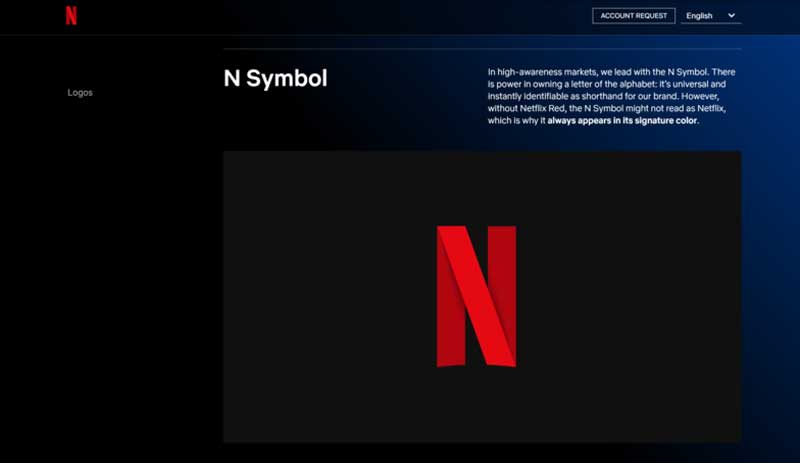
Netflix’s branding is so powerful that it has practically taken ownership of a letter of the alphabet. With its signature red branding on the letter N, it is easy to spot Netflix’s branding.
For its logo, it provides guidelines on color, clear space, context, readability, principles, and others. By following the guidelines, a creator would have no difficulty getting it right through the instructions provided.
Additionally, the voice of the brand remains consistently uplifting and fun. Instead of a more formal approach, the brand adopted a voice of friends speaking. This goes hand in hand with the service the brand provides.
#3 Linkedin
Source: LinkedIn
The business social media platform has a strong brand identity backed by firm brand guidelines.
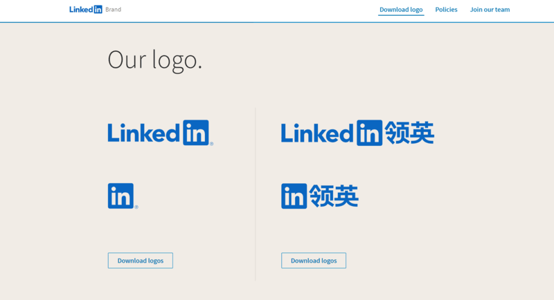
The company provides brand guidelines online that define how to use its name, logo, and materials. Making this available online ensures that anywhere its name is mentioned, its guide will be followed. This only adds to their strong brand identity as it standardizes any reference to their brand.
#4 The Patel Firm
Source: The Patel Firm
The Patel Firm is a great example of successful brand guidelines. The brand chooses a darker color palette and a more serious tone of voice that fits nicely with the services being offered.
The more formal voice adds an added layer of trust and expertise to the brand that customers are certain to connect with.
When you are in fields like law or medicine, one of the most common practices is to go for a color palette that uses colors like blue or green because they have been associated with trustworthiness.
According to studies, blue is perceived as the most trustworthy color. Within the medical and financial spaces, green was seen as a close second, and for the legal space, it was black that came in second.
Shaked Law is another firm in the legal space that has used blue in their color palette.
#5 Hulu
Source: Hulu
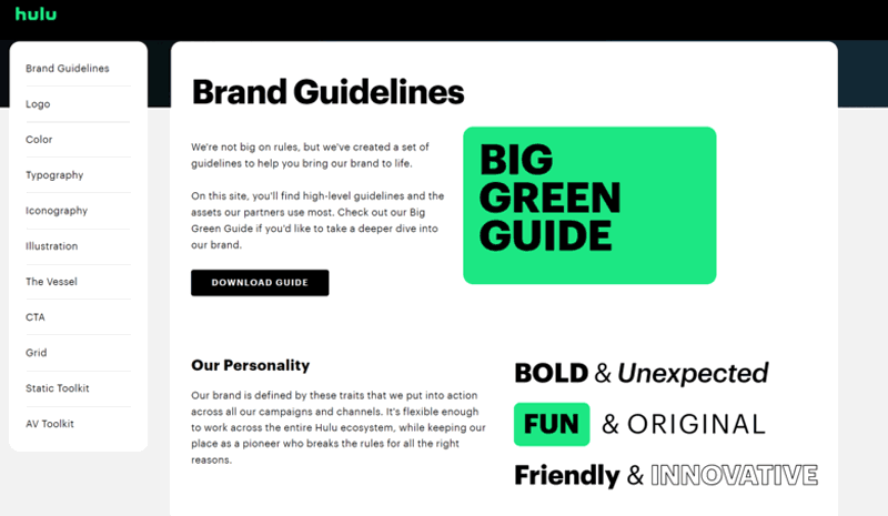
This streaming company provides in-depth guidelines on how their branding should be used and followed. The guidelines begin with a great introduction to the brand voice along with the brand characteristics.
The company states that its brand should be bold and unexpected, fun and original, and friendly and innovative. With characteristics like those, it should be unquestionable why the brand has seen so much success in its branding.
#6 WhatsApp
Source: Whatsapp
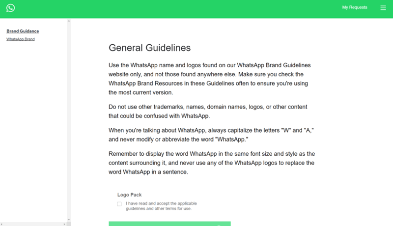
This messaging app is known worldwide by its bright green logo with a phone in the middle. So regardless of the language someone speaks, they are probably able to identify what it is and which company it belongs to.
Whatsapp has heavily invested in brand guidelines and is a great example of how they should be executed.
Final Thoughts on Brand Guidelines
Every brand needs an identifiable voice and look. To reach this, they must establish brand guidelines. Without these guidelines, it will be impossible to achieve a standardized look that will create a strong brand identity.
When a strong brand identity is in place, it will allow customers to identify your brand even without you having to state who you are. This is when you know the brand guidelines you put in place are truly a game-changer.
For more great tips, tricks, and how-to’s, subscribe to the DivvyHQ blog today!
