Service pages can be very valuable when executed well. They provide information and details about what you do and your USP (unique selling proposition). But what makes a high-converting service page?
We reviewed examples and pulled from our expertise to develop these lessons your enterprise content team can use to improve your service pages.
Are Your Service Pages Assisting Conversions?
Before you can learn from others, you’ll want to look at your own data and glean insights from your content analytics. By reviewing such metrics as pageviews, time on page, conversions, and bounces, you can unlock whether that page is performing.
If it is, that’s great. Try to replicate that magic for each service. If it’s not, then you have some work to do.
You also have to consider context and caveats. For example, a person just landing on your website for the first time might not convert. However, when service pages appear as links on your blogs, that indicates a desire to learn more. So, look at what the referral source was to the page.
Do You Have a Content Strategy for Service Pages?
Service pages are unique pieces of content and should be part of your content strategy. You are “selling” the service, but you never want to be salesy. Instead, take the approach of storytelling. Talk about the struggles of your audience and how your service supports them. Tell them how it solves their problems.
In building your strategy, you’ll want to determine what the pages should include. We’ll review that next, along with examples of companies doing it well.
What Should a High-Converting Service Page Include?
There are many attributes that a service page should have to drive toward conversions. Those include:
A Compelling, Relevant Headline
It should immediately hook a visitor because most people won’t make it further down the page.
Example: Shopify Marketing Services
- The simplicity of the value prop in the header makes a complex process – marketing – much more accessible to small businesses that are the target here.
Image: Shopify
The Lessons:
- Keep the header simple and benefit-focused rather than feature-focused.
- Be short and concise.
- Speak directly to the audience by using the second person.
A Value Proposition that Delivers on the Promise
A value proposition clearly explains what the service is, who can use it, and why it matters.
Example: Domo Services Page
- The sentence after the headline immediately reveals the value and who it serves. The page also includes solutions by role, industry, and data source.
Image: Domo
The Lessons:
- Define quickly what your audience will get out of the service.
- Break up a service page by addressing specifics so that a viewer immediately understands that the service can work for their needs.
Actionable Copy
You won’t drive many conversions without content that seeks to convince and persuade. It’s not the time to go on a soliloquy.
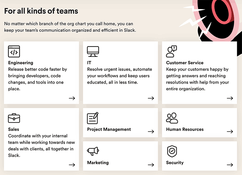
Example: Slack
- Slack’s solutions page has blocks that speak directly to issues by role and type of company. Each box begins with a verb, which urges action.
Image: Slack
The Lessons:
- Start copy with verbs to prompt a response.
- Speak specifically to how the service or solution fixes issues.
Call to Action (CTA) that Drives People to Click
Your CTA could be the most critical part of your service page. Without it, users will keep moving. It also needs to be clear and avoid any confusion, which causes click hesitation.
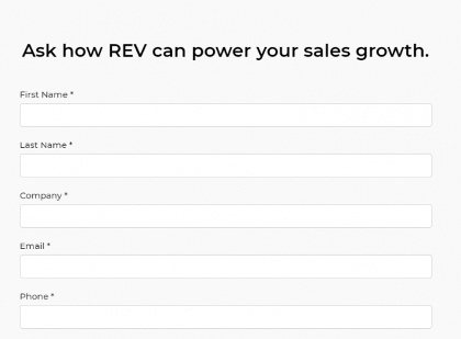
Example: Marketron REV
- What’s unique about the CTA is how it puts the user in control and makes them feel more apt to complete the form, just by using the word “ask.”
Image: Marketron
The Lessons:
- CTAs should always begin with a strong verb.
- Using the word “ask” makes the commitment to learn more less intimidating. After all, why wouldn’t you ask how something can power your sales growth?
Simple, Modern Design Helps Users Focus on What Matters
Decision impacts conversion. That includes the layout, graphics, imagery, fonts, and colors. For a high-converting service page, the design should grab attention but be scannable.
Example: Hootsuite
- Hootsuite’s service page for training is on-brand, easy to scan, and beautiful. It uses illustrations rather than actual photos, which tell a great story. There’s also plenty of white space and a good flow. It’s a long page, but it doesn’t elicit scrolling fatigue.
Image: Hootsuite
The Lessons:
- Imagery should be brand-specific, and the best way to do this is with illustrations versus stock photos.
- White space is good and makes the information easier to process, especially on mobile.
- In changing sections, the background color does as well, which signals to the brain that you’re moving to a new topic.
Using Social Proof to Gain Trust and Credibility
Inserting testimonials or case studies from customers on service pages shows prospects that your service is high-quality and reliable.
Example: Zencargo
- Their service page regarding freight costs and supply chain optimization features a success story quote that defines what the service did for the company. It also includes a name, title, and company.
Image: Zencargo
The Lessons:
- Testimonials that are specific, work best to build credibility.
- Quotes with names, titles, and companies appear more authentic.
- The review should be relevant to the specific service on the page.
More Lessons for Higher Conversions on Service Pages
- Create individual service pages for each one you provide to support organic SEO.
- Optimize each page with a relevant keyword. Long-tail ones are the best fit.
- Write it from the perspective of the audience, not from the viewpoint of your business.
- Use images and video appropriately, but make sure to compress them so they don’t impact page speed.
High-Converting Service Pages Drive Revenue Opportunities
Service pages shouldn’t be an afterthought. They can be a significant source of conversions when you apply these best practices and ideas. As you make changes, you’ll learn more about why a page converts or doesn’t. Use that data to keep improving!
Want more great content marketing tips? Subscribe to the DivvyHQ blog, written by and for content marketers.


