As a result of technological development, today’s hit marketing strategy is markedly different from that of, say, a decade ago. It may well still involve ad campaigns, banners, and TV spots— it’s just that they’ve had to move over and make some room for social media channels.
And with this change has come a redoubled focus on visuals. Marketers have always known about the powerful immediacy and impact they bring to the table, but now they have bountiful feeds through which to deploy them without having to pay for space or airtime.
Couple that with the increasingly informal nature of brand/consumer relationships, and you have a recipe for a more entertaining, attention-grabbing, and sporadic form of visual marketing for which I should really come up with some kind of catchy name.
While I think about that, let’s start taking a look at some of the elements that set the top brands apart. (Forgive me for using low-calorie ice-cream brand Halo Top a couple of times; I may have an unhealthy fixation.)
The Importance of Bold Palettes
What makes a palette bold? Is it mega-bright colors? Neons so harsh they will incinerate your optic nerve if you even think about looking at them? No, that would be a crazy thing to praise. Rather, it’s a level of distinction and vividity that makes it stand out very quickly.
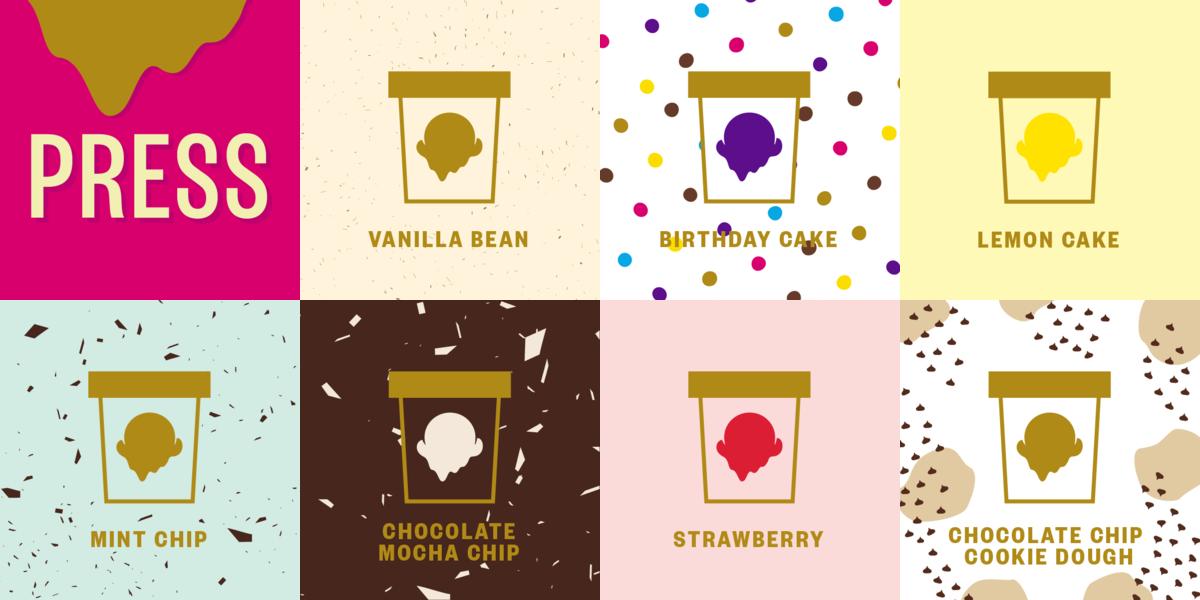
Leaping right into the aforementioned Halo Top, you can see a slice of their homepage product grid below, and boy howdy does it look delicious. I wouldn’t ordinarily consider eating a website, but in this case I’m torn. The shapes are sparse, the styles are minimal, and everything looks clean and fresh and bright.

I’d recognize these hallmarks anywhere, which I suppose is the point. The Birthday Cake pattern is also featured on the Birthday Cake packaging and used in promotional materials, and I now think of dessert whenever I see colorful spots. Think about that; they’ve branded so powerfully that they’ve co-opted the part of my brain that handles pattern recognition.
Then you have the big cheeses— the apex predators of the brand kingdom who fire out content to millions and millions of people every day. Coca-Cola’s Instagram is slickly-done stuff, vibrant, simple, and very animated (sometimes figuratively but often literally). Below, see two slides of a .GIF I won’t provide in its original state because the aspect ratio doesn’t work here.

Image credit: Coca-Cola’s Instagram
Is boldness always the goal? Well, there are exceptions, of course, but not that many. There’s even something of a visual version of ‘there’s no such thing as bad press’ to be found here. If you stick out using some hideous color combination, then hey, you still stick out, right? It isn’t ideal, but maybe it’s preferable to the alternative.
The Rise of Cutesy Fluff
I said I’d try to come up with a name for the new kind of visual marketing that’s so prevalent now, and I’ve got a doozy of a whimsical draft: cutesy fluff. It has a level of silliness I find appropriate for the kind of tone it generally strikes.
So what does cutesy fluff involve? Let’s run through some of the common features, and think about why they work so well:
Giving products personalities (anthropomorphism or zoomorphism)
To paraphrase Community, I can pick up a pencil, tell you its name is Steve, then break your heart a little by snapping it in two, because people can connect with anything. Products are just things, but give them personalities and we’ll start to care. We can’t help it.
Using perspective tricks to make fun and/or compelling juxtapositions
E.g. holding up a cookie to obscure the sun and making a corresponding pun. There isn’t generally a complexity to this; it’s just playful and fun. It’s also easy to do; either take a shot in situ, or Photoshop over free images of your choice.
Featuring distinctly-amateur art styles
This fits the general theme of childlike wonder, which is vital for bypassing that initial consumer skepticism. It spurs the viewer to think of how much fun it must have been to make, which gets them empathizing with the brand reps (sneaky!).
Using simple animation
Animation can be used for stylistic effect, or to tell a brief narrative. Either way, it’s mobile-friendly and bridges the gap between video and still image. Your audience is insanely distracted anyway, so why bother with anything fancy?
Being entertaining yet unashamedly promotional
We’re not total idiots: we know brands have social media accounts to sell us things. We like the simple idea of ‘We’ll look at your ads if you entertain us’, so it’s counterproductive to try to be subtle (or worse, to come across as apologetic). It’s all in the execution.
Focusing on positivity, employing negativity only in a wink-wink fashion
Being downbeat doesn’t sell products. We’re attracted to light-hearted and reassuring content that takes our minds off the worries of everyday life, particularly since social media has a bad habit of making us feel worse.
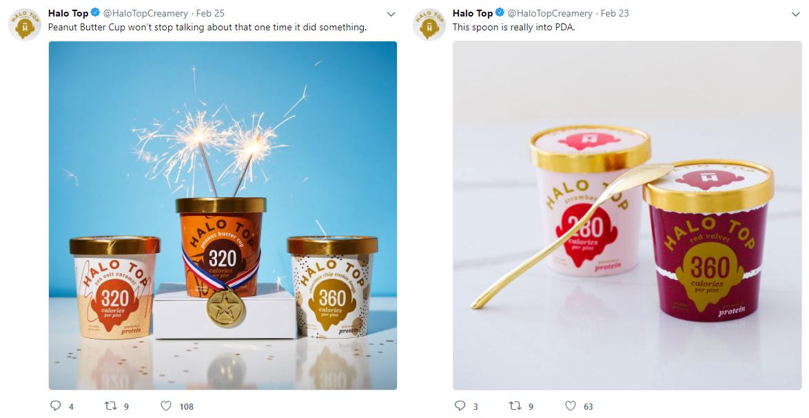
Let’s check out a couple of examples, and we’ll start with, yes, you guessed it: Halo Top. More specifically, their Twitter activity:

Image credit: Halo Top’s Twitter
How can you not like that? It’s cute, silly, doesn’t take itself too seriously, and is obviously promotional without being pushy or offering ten million CTAs. The goal is to sneak inside your brain and engender goodwill for the brand, so that later on, when you find yourself in a store around midnight and your level of exhaustion sets you on snacking autopilot, you’ll grab a tub of protein ice cream without really knowing why.

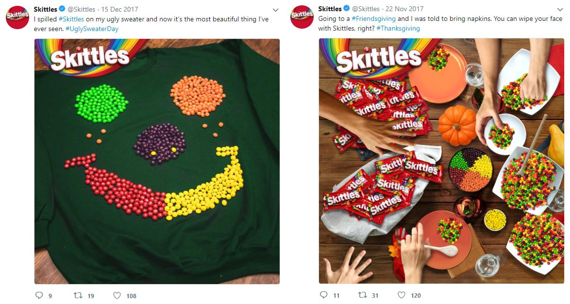
Image credit: Skittles’ Twitter
Now here we have Skittles, a brand that can hardly shy away from being colorful. They don’t do so much characterization but they make up for it in sheer Skittles-related volume. Every image pops right out of the screen, and will definitely get seen in even the busiest of feeds.
The Commandments of Visual Marketing
If you do something like run a funeral home, you’re going to have a tough time getting much purchase through social media (you can do some tasteful memorial work, but then your work is limited by the availability of deceased individuals anyway, so you probably aren’t looking to scale all that much).
But I’ll assume that you don’t, and that your business is absolutely in a position to embrace the feel-good chirpiness of social media. If that’s correct, and you’re under pressure to get marketing results ASAP on no money (ever the problem), then try sticking with these basic commandments:
1. Stand Out
Look through all the top brands in your social media feed. Then look at yours. Do you fit in with that group? Are you as sharp, as bold, as stylish? You need to be. And if you can find a way to stand out by ignoring every other commandment here, do it. It’s whatever works for you.
2. Target Emotion
Emotion drives retail— always has done, always will do. As long as there’s an uplifting slant, you can show anything: happiness, sadness, loss, heartbreak, boredom, rage…
3. Embrace ‘Cutesy Stuff’
You may be a very serious person, but the internet (provided you steer clear of controversial topics) is not a very serious place. If you want to impress the online populace, you need to appreciate self-deprecation and have some fun.
4. Be Willing to Experiment
Far too many companies never do anything interesting with their visual marketing because they’re so worried about the consequences of taking it too lightly that they don’t really take it at all. So play around. Snap some shots on your phone.
There are other technical things, of course—getting the right aspect ratio for the selected platform, compressing images optimally, etc.—but those things don’t result in excellence, just adequacy. They should be the bare minimum of what you achieve. No user will ever decide they like the look of your brand because you consistently tag your images correctly.
Get creative, have fun, and approach your marketing visuals with the focus of a statistician and the enthusiasm of a child. It’s an odd mix, I know, but the results will speak for themselves.
Featured Image Credit: #TitosOnTour Instagram