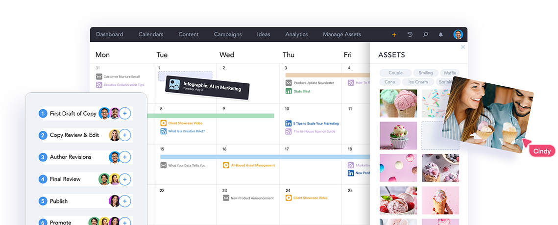
Meet Lytho Planner (formerly DivvyHQ) – the most powerful content calendar your team will ever use.
Organize your campaigns and content schedules, manage requests, and keep your content strategy sharp — all in one place. From automating production tasks to tracking performance, Lytho Planner helps your content and creative teams stay aligned and on schedule. It’s everything you loved about DivvyHQ, now with even more power to keep your content marketing on point.
Get Organized With a Central Content Operations Hub
Planner is specifically designed to be your central hub for managing all content requests, schedules, initiatives, and campaigns across your organization. We’ve baked in the best practices of content strategy and planning with such features as:
- Unlimited content calendars
- Customizable content types and content strategy fields
- Campaigns management
- Global content asset search
Provide Instant Visibility
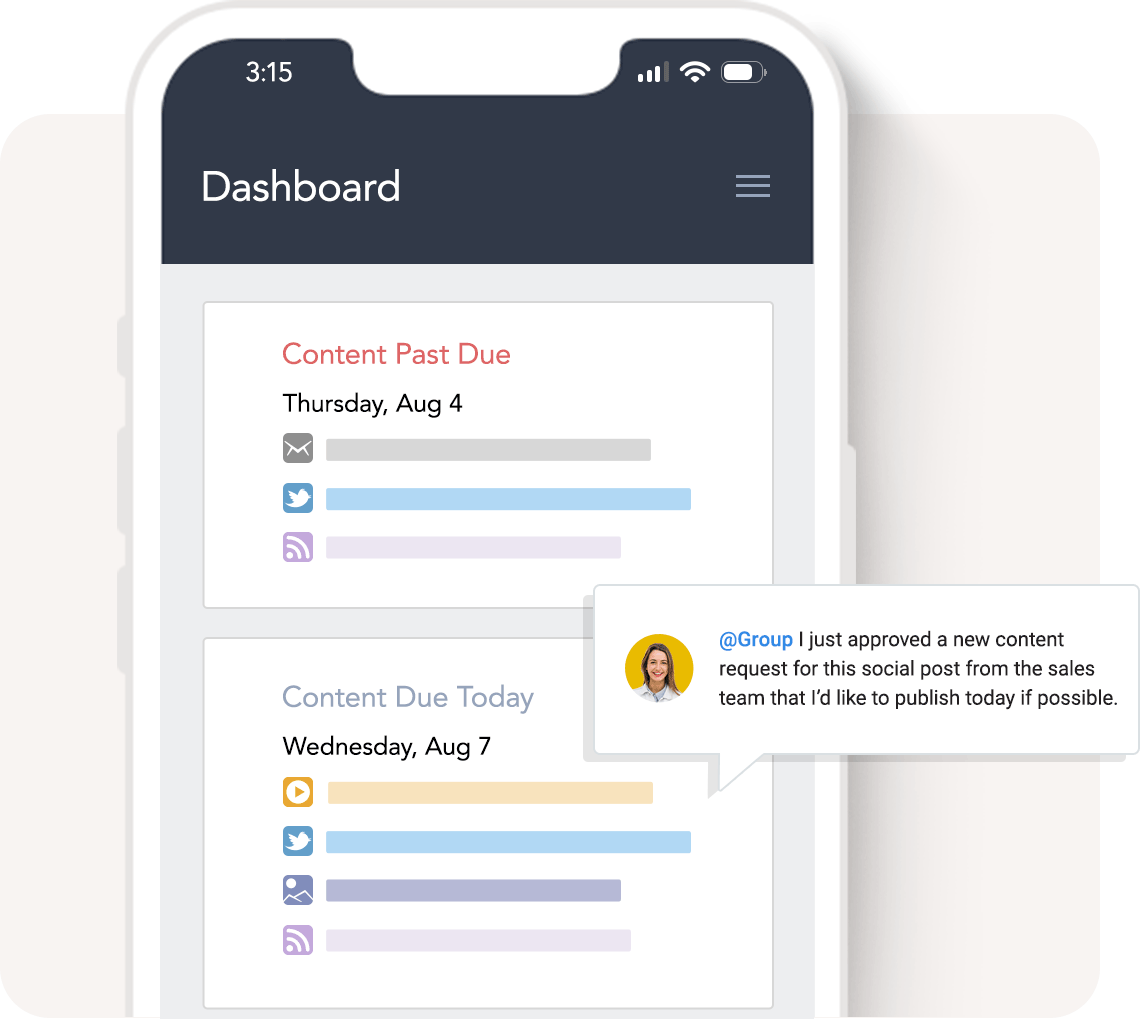
You need to know what’s due, what’s done, and what your team is working on right now. And your organization would love to have more visibility into what’s coming down the content pike. Who has the time to keep everyone in the loop?
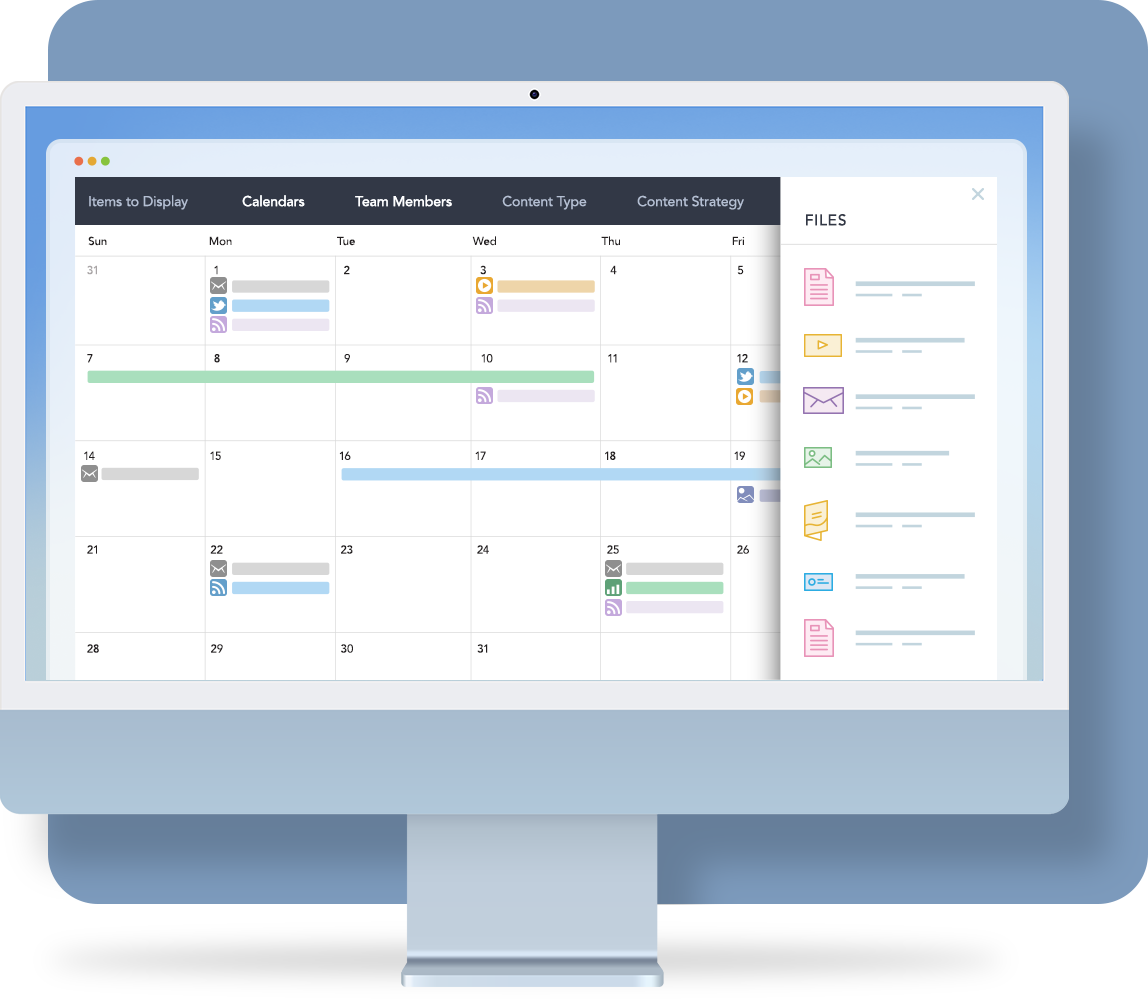
Let our content operations software handle that for you. A real-time view of your global content calendar is only a click away. Check out these key features:
- A real-time content project dashboard
- The most robust content calendar on the market
- Easily share your calendar with anyone
Need a central hub for all of your content planning and publishing needs? These brands did, too.
Manage Content Requests
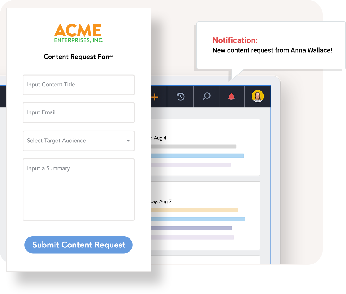
Keeping up with a never-ending onslaught of content requests from stakeholders across your company can quickly become a management nightmare. Avoid requests slipping through the cracks by formalizing your entire request intake process.
Planner’s Content Requests tool includes:
- A request form builder to create sharable intake forms
- A dedicated moderation area with built-in review and approval workflow
- One-click conversion from content request to scheduled content project
Content Strategy Documentation & Reporting
While Planner can’t create a content strategy for you, our content operations software does come equipped (out-of-the-box) with everything you need to house your strategy and report on its effectiveness.
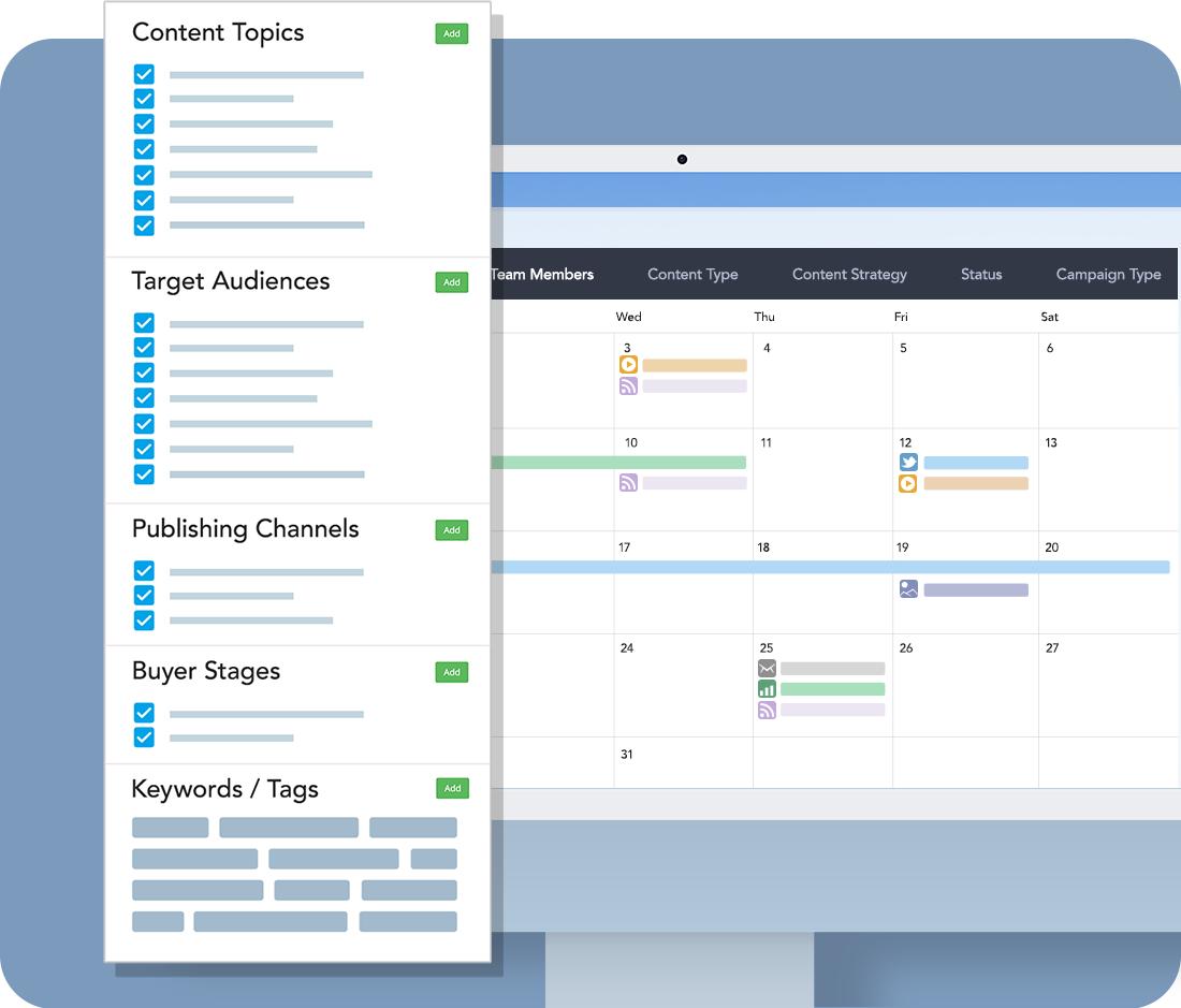
From the moment you create an account, you can start plugging in key content strategy metadata, including content topics, target audiences, buyer stages, keywords, and more! Then, when you initiate new content projects in Planner, each asset can be tagged with its relevant content strategy data, which fuels a wide variety of filtering and reporting features.
Publish Faster With Integrated Digital Asset Management
Integrate & Automate With AI
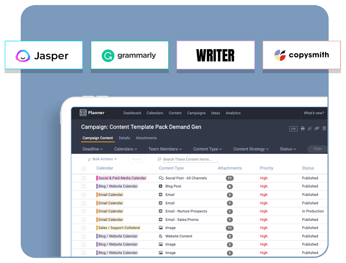
At Lytho, we’ve been thinking about how to incorporate AI to automate parts of the content process for years. But with the AI tech market moving at the speed of light, real-world applications are already here! AI integrations available now include:
- Jasper – Generate headlines, outlines, or complete first drafts in seconds
- Grammarly – Get help with spelling, punctuation, readability, and style
- Writer – Generate draft copy in any format or ensure your copy is following your brand style
- Copysmith – Ideal for bulk generation of e-commerce product content/descriptions
Track Content Performance
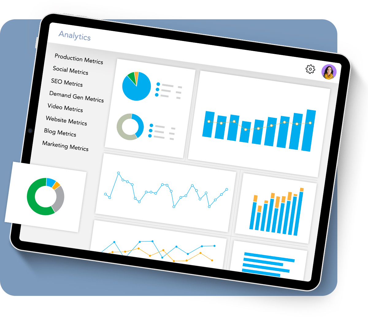
Your job isn’t done after you hit publish. Planner’s content analytics module gives marketers and comms teams a robust, customizable set of dashboards that bring all of your performance data into one platform and presents key metrics that tell the story of how your content is performing. Our solution is perfect for marketing and content teams who:
- Need to understand which content pieces, topics, and keywords are performing well
- Are tired of manually aggregating data from multiple sources
- Want an automated reporting mechanism to share results with executives
Even More Features(in case you have more boxes to check)
Production Task Templates
Define your production steps and let Planner automate scheduling and accountability.
Shared Idea Repository
Add ideas to your Parking Lot to review at your next content planning meeting.
Built-in Content Editor
Draft blog articles, email copy, social posts, and more with our integrated HTML editor.
Commenting & @ Mentions
Collaborate with your team and stakeholders to get assets to the finish line quicker.
Version Tracking
Spot-check edits with a side-by-side comparison of past drafts so nothing gets lost or forgotten.
Notifications
Keep all team members updated on new assignments, status changes, and task deadlines.
Mobile-friendly
Access your content calendar, reply to comments, and review content right from your phone.
Direct Publishing
Push content and assets directly to popular publishing platforms like WordPress.
Our customers tend to say it best.
Brenda L., DX Supervisor
"We explored several content marketing management systems. Some platforms are complicated and project management oriented. Lytho Planner is focused on content marketing for content marketers."
Ricky R., VP of Creative
"I no longer wonder what we're publishing today and so as a manager, I feel more in control and less worried about what is happening on a day-to-day basis. It also allows me retroactively to see when we had drop-offs in content output, so I can adjust my planning and identify production hiccups."
Jenna H., Content Marketing Manager
"We had too much volume to coordinate and review through email. We needed a central hub to track reviews, provide feedback, and keep us all organized. Now it’s all being accomplished through the Lytho Planner platform."
Dan R., Sr. Content Manager
"Planner really replaced our entire process and became the central repository for all of our content. It has improved workflow and communication between the team drastically."
