
A Simple Report to Analyze Your Website’s Content Effectiveness
This past weekend, I had the opportunity to speak at the 2012 Kansas City Wordcamp on the subject of “Measuring the Effectiveness of Your WordPress Website”. With only 30 minutes to present, I didn’t get a chance to dig into some of the custom Google Analytics reports that I use to measure content effectiveness and efficiency. One such report, created by Mr. Google Analytics himself, Avinash Kaushik, can provide amazing insights into the effectiveness of your individual website pages and blog posts. So I thought I’d dig into that a little more here and show you how to download it so that you can start leveraging it within your own analytics account.
Which Content Pieces are Moving the Needle?
Avinash’s Content Efficiency Report is a huge time saver, because it gives you one report with data that you would normally have to view within several, standard GA reports. Here’s a quick explanation of the metrics that it pulls and my thought process when reading it.
- Page Title – Whether you’re evaluating the effectiveness of a static web page, blog post or download, this report lists each page and helps you understand how site visitors are interacting with it.
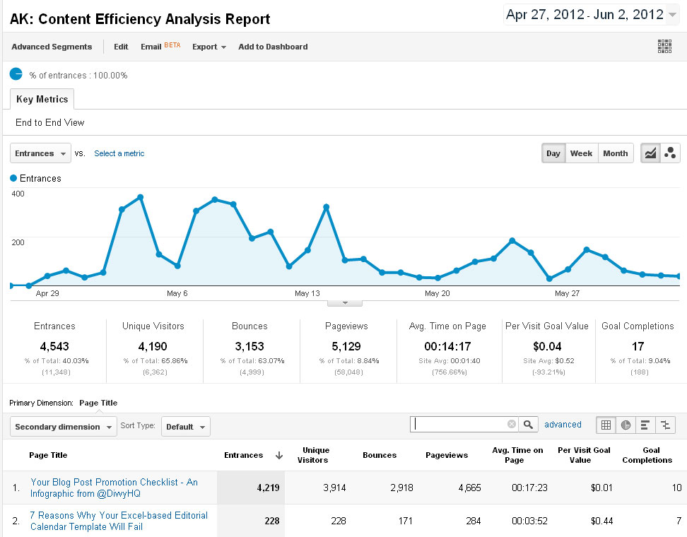
- Entrances – It’s great to find out which pages are acting as your site’s front door (vs. your homepage). Comparing this metric to your bounces can help you determine how well these entrance pages are doing to get visitors engaged in your site.
- Bounces – When a user enters your site, only views one page and then leaves, that’s a bounce. Most would think that pages or posts with high bounce rates are a bad sign, but it’s not that simple. Consider a blog post that you have promoted via Twitter. An interested visitor sees your tweet and rolls into read it. It’s the best post he’s read in a long time, so he leaves your site and proceeds to retweet your post within his Twitter client. This situation is still a bounce, but it doesn’t mean your content is bad. It does tell us, though, that we probably need to think about incorporating better calls-to-action and/or internal links that entice visitors to want to dig deeper into our site.
- Unique Visitors, Pageviews & Avg. Time on Page – I included these three together because combined, they do a good job of helping us understand how each page was consumed by the reader. In the screenshot above, our Blog Post Promotional Checklist was viewed by 3,914 unique people, but it was viewed 4,665 times, so many of those folks must have viewed it more than once. And then the Avg. Time on Page shows us how long they spent with it. Great to see people spending more than 17 minutes with that single piece of content.
Do You Smell Bacon?
The final two metrics in this report, Per Visit Goal Value and Goal Completions are the two that really help you understand which pieces of content are bringing home the bacon. But if you don’t have an actual goal set up within your GA account, and a goal value in place, then these columns are going to be blank. If you haven’t done that, watch this and get it done. With your goals and goal value set up, you should see values in these two columns.
- Per Visit Goal Value – This metric does some fancy math behind the scenes, but it’s basically an indicator of “visitor quality”. If you look at the screenshot above and compare the two pages, our checklist post pulled in a much lower quality of visitors based on the ratio of visitors to goal completions. When we do the math, that checklist post made us $39.14. Now compare that to the “7 Reasons” post. With only 228 visitors, it made us $100.32. Quality makes a HUGE difference.
- Goal Completions – Fancy math aside, it’s good to see which how many actual conversions are happening as a result of each piece of content. When goals are being completed, you must be doing something right. But then you might ask yourself…what improvements might I be able to make to increase conversion? Well that’s another post. But Google just rolled out a new analytics tool called “Content Experiments” that can help.
Want This Report? Here’s How to Get It
- Log into Google Analytics.
- Come back here.
- Now click on this link Page Efficiency Analysis Report. It will open in Google Analytics.
- Click on the Create Report button and it will save it in your account.
You can then click your “Custom Reports” button near the top of your GA dashboard to view your content effectiveness. I hope this helps you bring home more bacon. Mmmmm…
